
The Lantis: Stage Visual Collection | Vol. 1
<!--
Work info
--!>
Client:
The Lantis
Services:
Visual Jockey, Art Direction, Motion Graphic
Industry:
Music & Entertainment
Duration:
4 Days (1 Stage Visual)
Year:
2025-2026
Project Overview
Produced a high-fidelity visual experience for The Lantis that bridged technical precision with emotional storytelling. Utilizing Linear Timecode (LTC) technology, I engineered kinetic lyric visualizations that locked perfectly to the band's backing tracks for a seamless show. The scope included dynamic logo loops for strong brand presence and immersive background narratives that reacted strictly to the lyrical cues. This ensured every beat and word was amplified by a stunning visual counterpart.
My Approach
Understanding The Lantis' unique "retro-modern" identity, I avoided overly futuristic sci-fi visuals. Instead, I focused on kinetic typography and warm, grainy textures that complement their sound.
I designed the visuals with a "Camera-First" mindset. Knowing that concert-goers love to document moments, I engineered specific visual cues and color drops to ensure the stage looked stunning not just to the naked eye, but also through the lens of a smartphone camera.
Key Features
LTC Precision Sync: Automated lyric transitions driven by Linear Timecode for millisecond-perfect timing.
Kinetic Typography: Dynamic text animations that turn the stage into a massive, engaging karaoke experience.
Brand Loop Identity: 3D animated logo loops designed to maintain band awareness during instrumental breaks.
Photogenic Color Palette: Lighting-calibrated colors that look great on Instagram Stories.
Lyrical Atmosphere: Background visuals that change mood and color palette according to the song's narrative arc.
Credits
Crew: Delacrews (instagram.com/de.lacrews)
Photographer: Kisol (instagram.com/kisol_/)
Lighting: Ardipa (instagram.com/ardipa05)
Roadman: Taufik (instagram.com/taufikimansa)
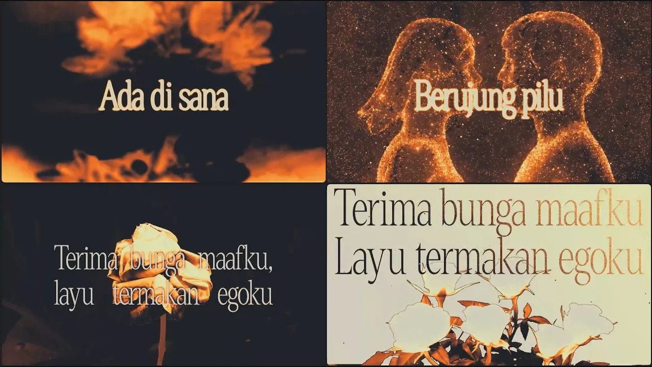
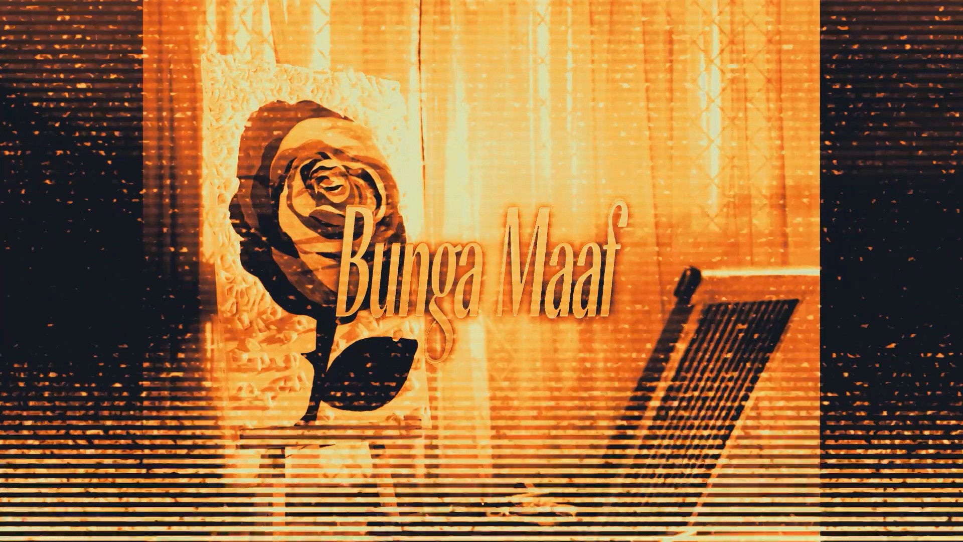
Bunga Maaf: Stage Visual
To honor The Lantis' retro-modern identity, I stepped away from sterile futuristic visuals and leaned into kinetic typography paired with warm, grainy textures. Orange serves as the foundational color to naturally trigger feelings of warmth and nostalgia. The central motif is a dried flower, a visual metaphor for the sadness, regret, and hopelessness of a delayed apology. Every aesthetic choice in this project is a direct translation of the song's emotional weight, designed to resonate deeply with anyone who listens.
A Nostalgic Approach
I utilized kinetic typography and warm grainy textures to honor their retro modern identity.
The Weight of an Apology
A dried flower motif bathed in orange perfectly captures the regret and warmth of the song.
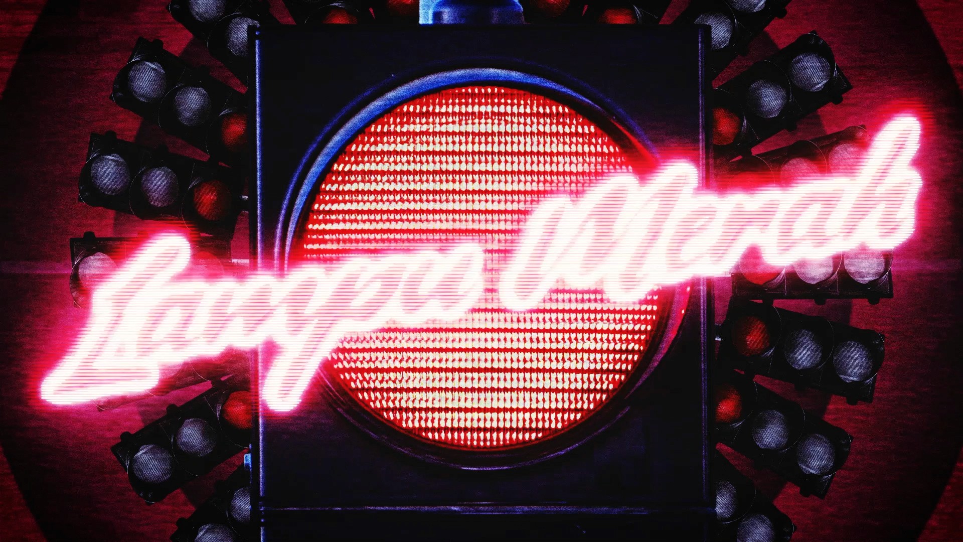
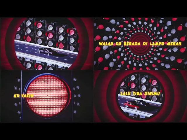
Lampu Merah: Stage Visual
A lone car navigating an endless highway serves as a visual metaphor for our perpetual journey toward the life we desire. Just as life holds no absolute finish line, the drive continues indefinitely. To anchor the narrative of "Lampu Merah", glowing traffic lights line the streets. When the chorus hits, these lights multiply into a mesmerizing, circular tunnel. This hypnotic loop is intentionally designed to pull the audience into a trance, completely immersing them in The Lantis' universe. Drenched in a vibrant palette of red, blue, and yellow, the screen radiates pure energy. I paired this vivid color scheme with a playful, cartoon-inspired typeface to inject a strong essence of fun into the live performance.
The Perpetual Journey
An endless highway with glowing traffic lights mirrors our continuous journey through life.
Hypnotic Immersion
Vibrant colors and a circular tunnel loop pull the audience into a fun energetic trance.
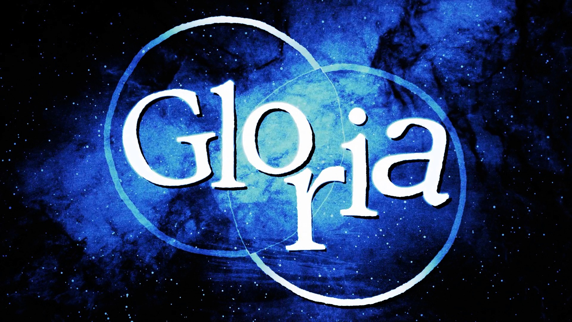
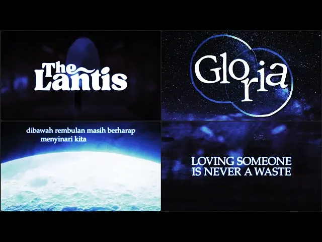
Gloria: Stage Visual
To capture the profound heartache within "Gloria", I drowned the stage in deep melancholic blue. This color palette directly reflects the sadness, emptiness, and quiet despair of longing for someone to return. I elevated this emotional gravity by selecting a majestic serif typeface to give the lyrics a grand and deeply resonant presence. The visual journey mirrors the process of grief itself. After navigating through the sorrow of the performance, we must ultimately learn to let go. That is why the visual concludes with a single lingering phrase: "Loving someone is never a waste." Placed at the very end as a moment of emotional closure, it serves as a highly shareable quote. It is intentionally designed for the audience to capture and post on their stories as a digital reflection of their own unspoken feelings.
Drowning in Melancholy
Deep blue hues and a majestic serif typeface capture the profound heartache of the song.
A Digital Reflection
The closing quote provides emotional closure and a highly shareable moment for the audience.